Go back to list of posts
12 Digital Business Card Examples Worth Copying in 2026
Last modified: August 24, 2026


This article gives you 12 real-world digital business card examples across marketing, photography, real estate, catering, nonprofit, finance, and events, plus a quick copyable idea from each. The highest-converting sharing methods right now are an app-less web link, a QR code, NFC taps, and wallet passes, in that rough order of setup speed. Teams that need templates, analytics, and CRM sync at scale typically reach for a platform like KADO rather than managing individual cards one by one.
Before you scroll through the gallery, here’s what to grab immediately:
- Pick one CTA per card. Not three, not five.
- Use an app-less URL as your default share method, then layer QR and NFC on top for events.
- Add a visible headshot or logo. Cards with a face attached get remembered longer.
Key Takeaways
The digital business card examples that convert best share three traits: one clear call-to-action, a visible photo or brand mark, and a sharing method that requires zero app downloads from the recipient.
| Point | Details |
|---|---|
One CTA per card | Cards with a single clear action outperform ones juggling multiple competing buttons. |
App-less sharing wins | A browser-based link removes the download barrier that kills most card-to-contact conversions. |
Hybrid stacks for events | Pair a printed card with QR or NFC for conferences; go QR-only for high-volume mixers. |
Track clicks, not just views | Link-level analytics separate curious scanners from warm leads worth an immediate follow-up. |
KADO for team rollouts | KADO adds brand-locked templates, CRM sync, and event analytics for teams scaling beyond one card. |
Digital Business Card Examples Across 12 Industries
Every example below solves a different problem. A marketer needs payment friction removed. A recruiter needs a fast yes/no path to booking a call. Look for the pattern that matches your role, then borrow the specific mechanic, not just the color scheme.
1. The marketer with an embedded payment link
A performance marketer running freelance campaigns puts a Stripe or PayPal link directly on the card, right under her headline. The goal is collapsing the gap between “I like your work” and “I paid you a deposit.” The idea to borrow: place the payment link as the second tap option, right after “Save Contact,” not buried in a bio section. Shared via QR at pitch meetings and an app-less link in email signatures.
2. The photographer with a visual portfolio strip
A wedding photographer’s card opens straight into a horizontally scrolling image strip, three shots wide, before any text loads. The goal is proving skill in under two seconds. Borrow this: use your three strongest, most different images (not three similar poses) so the strip reads as range, not repetition. Shared through NFC-enabled prints left on venue tables during vendor walkthroughs.

3. The realtor with a listings link front and center
A residential realtor skips the long bio and puts “Current Listings” as the single primary button above the fold. The goal is routing warm traffic straight to inventory instead of a static resume. Borrow this: rotate the listings link weekly so the card never points to a sold property. Shared via yard-sign QR codes and a wallet pass for repeat clients.
4. The caterer with a menu and order link
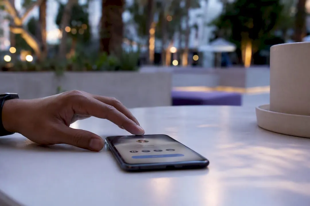
A catering company’s card leads with “This Week’s Menu” and “Place an Order,” skipping the “About Us” section entirely. The goal is turning a networking scan into same-day revenue. Borrow this: swap the primary CTA seasonally so regulars always see something new. Shared through table-tent QR codes at tastings and an app-less link texted after inquiry calls.
5. The company director with a headline that states outcomes
Borrow this: rewrite your headline as a result, not a title. Shared via NFC card tap at board meetings and industry dinners.
6. The sports club with a membership call to action
A local running club’s card leads with “Join Our Next Group Run” and a single-tap RSVP link, instead of contact details. The goal is converting casual scans into member sign-ups. Borrow this: make the CTA time-bound (“This Saturday, 7am”) so it feels urgent rather than evergreen. Shared through printed NFC stickers on flyers and a QR code at the finish line of local races.
7. The CFO with visible qualifications and trust signals
A CFO’s card places CPA credentials, a CFA designation, and two recognizable past employers directly below the name, before any bio copy. The goal is establishing financial credibility in a field where trust gates everything. Borrow this: use a small badge row instead of a paragraph. Shared via app-less link in email signatures and a wallet pass for recurring client meetings.
8. The nonprofit with thematic color and a donation link
An environmental nonprofit’s card uses a deep forest green palette matched to its logo, with “Donate Now” as the only button. The goal is emotional consistency between brand and ask. Borrow this: match your card’s color to your cause’s dominant brand color, not a generic template default. Shared through QR codes on event banners and NFC taps at fundraising galas.
9. The recruiter with a book-interview CTA
A technical recruiter’s card skips a bio and drops straight into “Book a 15-Minute Call” with an embedded calendar link. The goal is removing the back-and-forth scheduling email entirely. Borrow this: set your booking link to show only three open slots at a time, which creates gentle urgency. Shared via app-less link in LinkedIn messages and QR at career fairs.
10. The freelance designer with a thumbnail portfolio grid
A brand designer’s card shows a 2x3 grid of past logo work as thumbnails, tappable to expand. The goal is letting the work speak before any pitch happens. Borrow this: keep every thumbnail the same aspect ratio so the grid looks intentional, not scattered. Shared through NFC card taps at design meetups.
11. The consultant with a case study link
The goal is proof over promises. Borrow this: use a specific, numbers-first case study title, never a vague “Success Story.” Shared via app-less link and QR code on printed leave-behind sheets.
12. The speaker with a talk schedule and conference CTA
A keynote speaker’s card switches into “conference mode” at events: it shows talk title, room number, and time slot at the top, with “Connect After My Talk” as the CTA. The goal is capturing the exact audience who just watched the talk, while the interest is fresh. Borrow this: swap the card’s primary content for the event window, then swap it back afterward. This is the clearest use case for dynamic QR codes that can be updated without reprinting anything.
Pro Tip: Screenshot your three favorite examples above and note which single element (headline, CTA, or photo strip) you’re stealing before you start building. Trying to copy everything at once is how cards end up cluttered.
Conference-specific cards convert better when they pair a physical object with a digital layer. Hybrid stacks that combine a premium printed card with a QR or NFC link to a digital profile tend to outperform either paper or a purely digital approach for memorability and lead capture.
How Do You Create a Digital Business Card in Minutes?
Start by picking a web platform with a template close to your industry. Free tiers usually cover the basics; paid tiers add team templates, CRM sync, and view analytics.
- Choose a template that matches your role (sales, creative, executive).
- Fill in name, title, and contact details.
- Upload a headshot or logo, sized for a circular or square crop.
- Write a one-line headline that states an outcome, not just a job title.
- Add two to four priority links (booking, portfolio, listings, payment).
- Set one primary call-to-action button.
- Publish and generate your unique link and QR code.
- Optionally order an NFC card or add the card to Apple Wallet or Google Wallet.
The most common professional format right now is an app-less web profile: a unique URL that opens straight in a phone browser, so a recipient can save your contact without downloading anything first.
Before you trust the card at your next event, run this checklist:
- Open the link on both an iPhone and an Android phone.
- Tap “Save Contact” and confirm it drops into the phone’s native contacts app.
- Test the NFC tap against another phone if you ordered a card.
- Scan your own QR code from across a table to check size and contrast.
- Check that your link’s UTM tag or analytics dashboard is actually recording the click.
Pro Tip: Test your card on a phone with a cracked screen protector or an older Android model. Cheap NFC chips sometimes fail on lower-end hardware, and you won’t find that out until you’re standing in front of a prospect.
For teams, the workflow adds one more layer: brand-locked templates so no one on staff improvises their own layout, plus CRM sync so a scanned card becomes a logged contact automatically. Platforms like KADO build this in at the team tier.
What Design Rules Actually Make a Card Work?
Design choices earn their place only if they reduce the number of taps between “interested” and “converted.” Priority order matters more than any individual design flourish.
- Name and role, unmistakably clear — no cute fonts that sacrifice legibility for style.
- One CTA, not three — a card with “Book a Call,” “Buy Now,” and “Follow Me” all competing usually gets none of them tapped.
- A visible photo or brand mark — faceless cards get scanned and forgotten.
- One or two trust signals — a certification, an award, a recognizable past client. More than two starts to read as padding.
- A prominent link to your portfolio or booking page — buried links don’t get clicked.
- A payment link only when the relationship supports it — a first-touch networking card with a payment button up top reads as presumptuous in most industries outside freelance services.
Friction kills conversion faster than weak design. An app-less browser experience, large tap targets, readable contrast, and a one-tap vCard save matter more than any color choice. Interactive card layouts that place an avatar, role, and CTA row above the fold consistently outperform cluttered, scroll-heavy designs.
For events specifically, switch into conference mode: show your talk title and time slot, pair a printed NFC card as the physical hook, and route the QR to an event-specific landing page rather than your general card. NFC works best for fast one-on-one exchanges, with QR as the universal fallback for people who don’t have NFC-enabled phones or don’t want to tap.
Measurement closes the loop. Add UTM parameters or a unique QR code per event, then check your analytics within 48 hours to prioritize who gets a follow-up call first.
Pro Tip: Set a calendar reminder for 48 hours after any event to check your card’s click analytics. Interest decays fast, and the lead who clicked your booking link on day one is a warmer conversation than the one who clicked on day five.
How KADO Helps Teams Scale Cards Without Losing Brand Control
Analytics and follow-up are what turn a digital business card from a novelty into pipeline. Tracking opens and clicks tells a team exactly which contacts warrant an immediate call versus a slower nurture sequence, based on findings from Digital Journal’s reporting on event networking.
KADO’s relevant capabilities map directly onto the problems raised above:
- Multi-channel sharing (QR, NFC, wallet, app-less link) so every team member covers every scenario.
- AI-powered paper card scanning for events where you still collect physical cards.
- Team-level templates and brand controls so no one improvises a mismatched layout.
- CRM integrations that turn a scanned card into a logged, taggable contact automatically.
Comparing Popular Digital Business Card Platforms
Most platforms fall into three tiers, and the differences show up fastest in team features rather than the basic card builder.
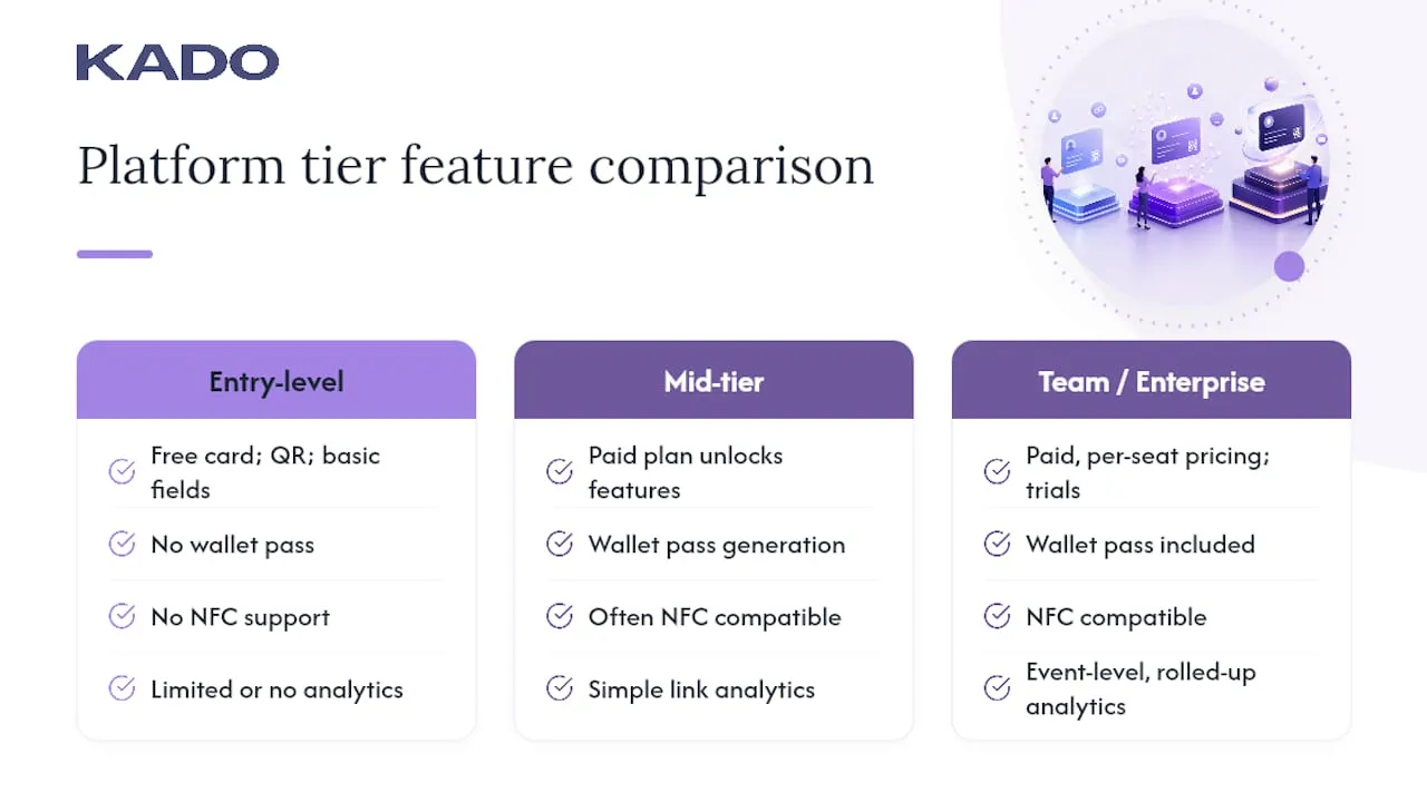
Entry-level, single-user apps typically offer a free card, a QR code, and basic contact fields, with limited or no analytics. These fit solo freelancers testing the format for the first time.
Mid-tier platforms add wallet pass generation, NFC card compatibility, and simple link analytics, usually gated behind a paid individual plan.
Team and enterprise platforms, including KADO, add brand-locked templates, admin controls over what employees can edit, CRM sync (Salesforce, HubSpot, Microsoft Dynamics), and event-level analytics that roll up across an entire sales floor. Pricing at this tier scales per seat, with free trials common before committing to an annual contract.
The trade-off is straightforward: cheaper tools save money upfront but push manual work (brand consistency checks, exporting contacts, chasing follow-ups) onto whoever manages the team. Platforms built for scale trade a higher price for less manual overhead.
What Should You Evaluate Before Choosing a Platform?
Four criteria separate a card that works from one that becomes a maintenance headache.
Sharing flexibility. Confirm the platform supports QR, NFC, app-less links, and wallet passes natively, not as a bolted-on afterthought.
Editability without reprinting. A card that requires a new NFC chip order every time your title changes defeats the purpose of going digital.
Analytics depth. Basic view counts tell you almost nothing. Look for click-level tracking on individual links so you can see which CTA actually drove action.
Team scalability. If you manage more than one person’s card, check for brand template locking and admin-level controls before you onboard a whole department.
Common Pitfalls When Choosing a Digital Business Card Service
The most expensive mistake is picking a tool built for individuals, then trying to force it into a team rollout six months later.
Watch for these red flags:
- No app-less viewing option, meaning recipients must download an app just to see your contact details.
- Static QR codes that can’t be redirected once printed, so a URL change means reprinting everything.
- No CRM integration path, which quietly creates a second, disconnected contact database.
- Vague or missing analytics, so you have no way to tell a curious scan from a genuine lead.
- No compliance information (SOC 2, GDPR) listed anywhere, which matters more once a legal or procurement team gets involved at the enterprise tier.
Hybrid or Pure-Digital: Which Fits Your Event?
For high-touch events like conferences and galas, run a hybrid stack: a premium printed card plus a QR or NFC link to your full digital profile. For volume-driven networking, like a startup mixer or a trade show floor, go pure-digital with QR-only sharing since speed matters more than the tactile hook. The rule of thumb: if you’ll have five minutes of real conversation, print something; if you’re passing a hundred people in an hour, skip the print run entirely.
Try KADO for Your Next Card Rollout
KADO gives teams a way to standardize card design across every employee while still capturing usable lead data from each scan. Sales floors and recruiting teams often use it specifically because it syncs captured contacts into existing CRMs (Salesforce, HubSpot, Microsoft Dynamics) instead of leaving leads stuck in a separate app nobody checks.
Pro Tip: Start with one free card before rolling anything out team-wide. Testing the save-to-contacts flow, the QR scan distance, and the link analytics on your own card first catches problems before fifty coworkers hit the same snag at once.
If you’re running a booth or sponsoring a conference this year, KADO’s event ROI tracking shows which scans turned into real conversations, so your team knows exactly who to call back first.
Sources
Frequently Asked Questions
What Should a Digital Business Card Look Like?
It should show a clear name and role, a visible photo or logo, one primary call-to-action, and no more than two trust signals, all viewable without downloading an app.
Is There a Way to Create a Digital Business Card?
Yes. Most platforms let you fill in your details, upload a photo, and generate a shareable link or QR code within minutes, with free tiers covering the basics and paid tiers adding analytics and CRM sync.
What Is the Most Common Digital Business Card Format?
An app-less web profile accessed through a unique URL is the most common format, since it opens directly in a phone’s browser and lets recipients save your contact without installing anything.
Is There a Free Digital Business Card App Available?
Yes, most platforms, including KADO, offer a free entry tier for creating a basic card, with paid plans reserved for team templates, CRM integrations, and detailed analytics.
Should I Use QR Codes or NFC at Conferences?
Use NFC for quick one-on-one taps and QR codes as the universal fallback for anyone without NFC-enabled hardware or who prefers scanning over tapping.